Transformer Visualization: 블랙박스 AI를 들여다보는 방법

요즘 ChatGPT, Claude 같은 AI 모델들 쓰다 보면 이런 생각 한 번쯤 들지 않나요?
“얘네는 대체 어떻게 이렇게 그럴듯하게 대답하는 거지?”
저도 딱 그랬어요. 그래서 Transformer 모델 내부를 “어떻게든” 들여다볼 방법들을 이것저것 찾아봤고요. 오늘은 이 블랙박스 같은 모델을 시각화로 이해하는 방법들을 정리해서 공유해볼게요!
왜 Transformer Visualization이 필요할까?
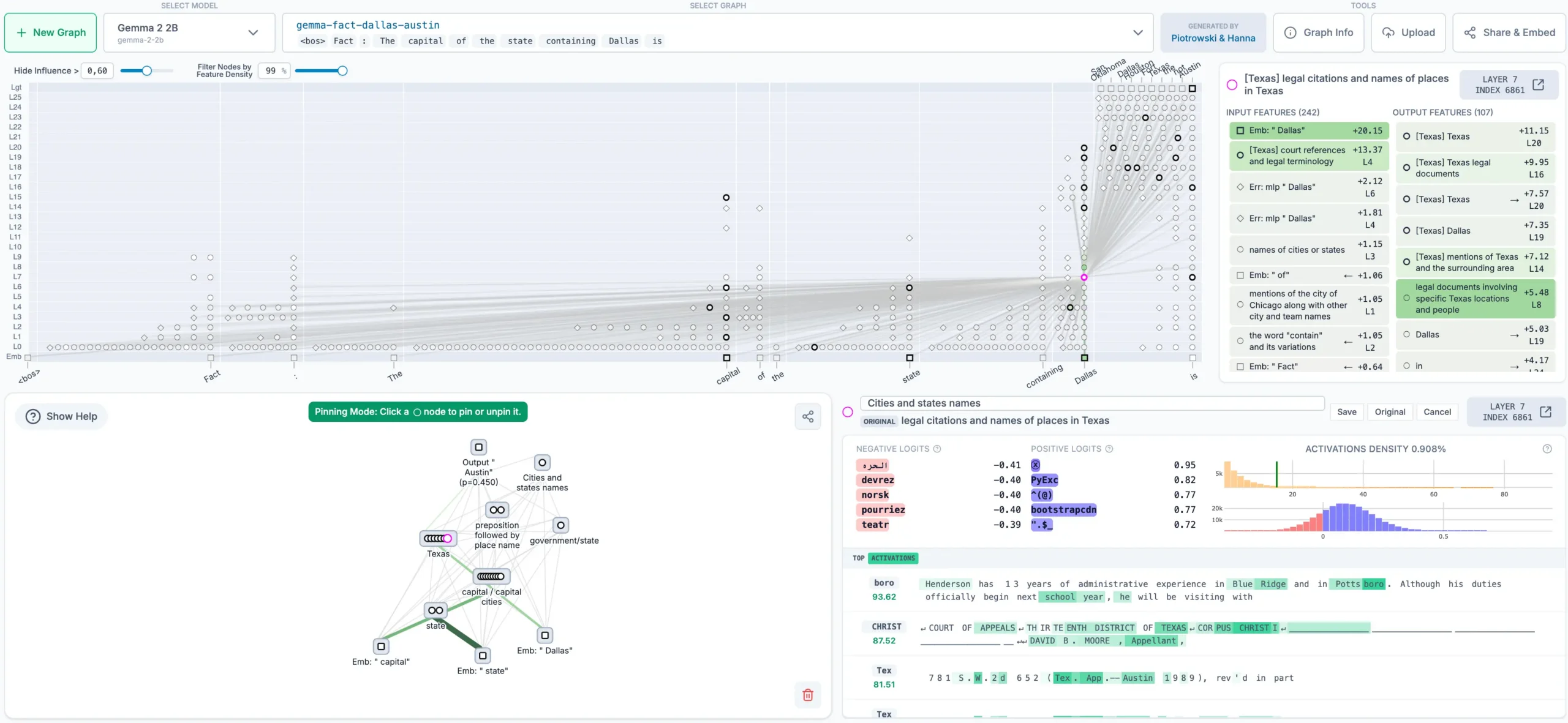
Transformer 모델이 대단하다는 건 알겠는데, 내부에서 실제로 무슨 일이 벌어지는지 모르면 괜히 답답하잖아요.
특히 모델이 이상한 답변을 내놓을 때, “왜 이런 결과가 나온 거지?” 싶은 순간들 꼭 생기죠. Transformer Visualization을 활용하면 이런 것들을 확인할 수 있어요:
- Attention이 문장의 어디에 집중하는지
- 각 레이어에서 정보가 어떻게 변형되는지
- 모델이 특정 단어를 예측할 때 어떤 토큰들을 참고하는지
디버깅할 때도 꽤 유용하고, 모델 성능 개선 포인트를 찾는 데도 힌트를 많이 얻을 수 있더라고요.
이미지 출처: 틸노트
Attention Visualization - 가장 기본적인 방법
Transformer의 핵심은 역시 Attention 메커니즘이죠.
이걸 시각화하면 모델이 입력 문장의 어떤 부분을 주로 바라보는지 한눈에 볼 수 있어요. 보통 히트맵 형태로 표현하는데, 생각보다 구현도 간단합니다.
import torch
import matplotlib.pyplot as plt
import seaborn as sns

def visualize_attention(attention_weights, tokens):
    """
    Attention weights를 히트맵으로 시각화
    """
    fig, ax = plt.subplots(figsize=(10, 8))

    sns.heatmap(
        attention_weights.detach().cpu().numpy(),
        xticklabels=tokens,
        yticklabels=tokens,
        cmap='viridis',
        ax=ax
    )

    plt.xlabel('Key Tokens')
    plt.ylabel('Query Tokens')
    plt.title('Attention Weights Heatmap')
    plt.tight_layout()
    plt.show()


실제 사용 예시

tokens = ['The', 'cat', 'sat', 'on', 'the', 'mat']
attention = model.get_attention_weights(input_ids)
visualize_attention(attention[0][0], tokens)  # 첫 번째 레이어, 첫 번째 헤드
이렇게 보면 각 단어가 다른 단어들과 얼마나 연결되어 있는지 색으로 표현돼요. 진한 색일수록 더 많이 참고한다는 뜻입니다!
BertViz로 Multi-Head Attention 파헤치기
그런데 Transformer는 Multi-Head Attention을 쓰잖아요? 여러 개의 헤드가 동시에 작동하다 보니, 이걸 전부 일일이 시각화하려고 하면 코드가 금방 복잡해져요.
그래서 많이들 쓰는 게 BertViz라는 라이브러리예요. 한 번 써보면 “왜 다들 추천하는지” 바로 느낌 옵니다.
from bertviz import head_view, model_view
from transformers import AutoTokenizer, AutoModel


모델과 토크나이저 로드

model_name = 'bert-base-uncased'
model = AutoModel.from_pretrained(model_name, output_attentions=True)
tokenizer = AutoTokenizer.from_pretrained(model_name)


입력 텍스트

text = "The transformer visualization helps understand model behavior"
inputs = tokenizer.encode(text, return_tensors='pt')


Attention 가져오기

outputs = model(inputs)
attention = outputs.attentions


Head View로 시각화

tokens = tokenizer.convert_ids_to_tokens(inputs[0])
head_view(attention, tokens)
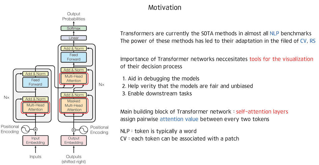
Head View를 쓰면 각 헤드가 어떤 패턴을 학습했는지 인터랙티브하게 확인할 수 있어요.
실제로 보면 어떤 헤드는 구문 구조 쪽을 잘 보고, 어떤 헤드는 의미적 관계를 더 강하게 잡는 식으로 역할이 갈리는 경우도 있더라고요. 꽤 신기합니다.
이미지 출처: 콥스랩 기술 블로그 - 티스토리
Layer별로 보는 Model View
BertViz의 Model View를 쓰면 한 단계 더 재밌는 걸 볼 수 있어요.
전체 레이어를 한 번에 훑으면서, attention이 레이어를 따라 어떻게 흘러가는지 추적할 수 있거든요.
from bertviz import model_view


전체 레이어의 attention 시각화

model_view(attention, tokens)
직접 돌려보면 느껴지는데, 초반 레이어에서는 주로 인접한 단어들끼리 attention이 강하고, 레이어가 깊어질수록 멀리 떨어진 단어들 사이의 관계도 점점 더 잘 잡아내는 경향이 있더라고요.
레이어가 깊어질수록 추상화 수준이 높아지는 느낌이랄까요?
Attention Flow로 경로 추적하기
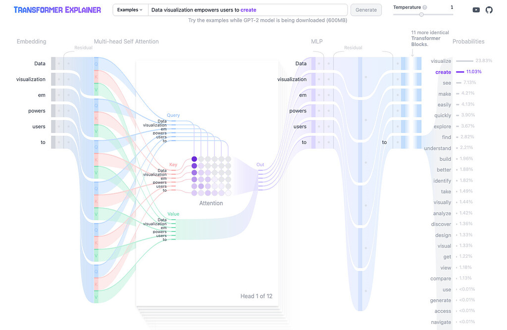
다만 여기서 아쉬운 점이 하나 있어요. 특정 토큰에 대한 attention이 레이어를 거치면서 “어떻게 변하는지”를 한눈에 보기에는 좀 어렵다는 거죠.
그래서 나온 게 Attention Flow라는 개념이에요. 말 그대로 attention의 흐름을 시각화해보는 방식입니다.
def visualize_attention_flow(attentions, token_idx, tokens):
    """
    특정 토큰에 대한 attention flow 시각화
    """
    num_layers = len(attentions)
    num_heads = attentions[0].shape[1]

    fig, axes = plt.subplots(num_layers, 1, figsize=(12, 3*num_layers))

    for layer_idx, attention in enumerate(attentions):
        # 모든 헤드의 평균
        avg_attention = attention[0].mean(dim=0)[token_idx].detach().cpu().numpy()

        axes[layer_idx].bar(range(len(tokens)), avg_attention)
        axes[layer_idx].set_xticks(range(len(tokens)))
        axes[layer_idx].set_xticklabels(tokens, rotation=45)
        axes[layer_idx].set_title(f'Layer {layer_idx + 1}')
        axes[layer_idx].set_ylabel('Attention Weight')

    plt.tight_layout()
    plt.show()


특정 단어(예: 'transformer')에 대한 flow 보기

target_idx = tokens.index('transformer')
visualize_attention_flow(attention, target_idx, tokens)
이렇게 하면 `'transformer'`라는 단어가 각 레이어에서 어떤 단어들에 주목하는지 레이어별로 쭉 추적할 수 있어요.
이미지 출처: 파이토치 한국 사용자 모임
Neuron Activation으로 더 깊이 파고들기
Attention만 봐서는 뭔가 아쉬울 때가 있죠. Transformer Visualization에서 더 깊게 들어가려면 뉴런 활성화를 보는 방법도 있습니다.
FFN(Feed-Forward Network) 레이어의 뉴런들이 어떤 패턴에 반응하는지 확인하면, 모델이 실제로 무엇을 학습했는지에 대한 힌트를 얻을 수 있어요.
import torch.nn.functional as F

def analyze_neuron_activation(model, input_text, layer_idx=6):
    """
    특정 레이어의 뉴런 활성화 분석
    """
    # Hook을 사용해서 중간 레이어 출력 캡처
    activations = {}

    def hook_fn(module, input, output):
        activations['ffn'] = output

    # Hook 등록
    hook = model.encoder.layer[layer_idx].intermediate.register_forward_hook(hook_fn)

    # Forward pass
    inputs = tokenizer(input_text, return_tensors='pt')
    outputs = model(**inputs)

    # Hook 제거
    hook.remove()

    # 활성화가 높은 뉴런 찾기
    ffn_output = activations['ffn'][0]  # [seq_len, hidden_size]
    top_neurons = ffn_output.max(dim=0).values.argsort(descending=True)[:10]

    return top_neurons, ffn_output


실제 분석

top_neurons, activations = analyze_neuron_activation(
    model,
    "The transformer model uses self-attention mechanism"
)

print(f"가장 활성화된 뉴런들: {top_neurons}")
이걸 여러 문장으로 돌려보면 은근히 재밌는 패턴이 보이기도 해요.
어떤 뉴런은 부정문에서만 유난히 반응한다든지, 어떤 뉴런은 특정 품사에서만 활성화가 튄다든지요.
실전 팁: Transformer Visualization 제대로 활용하기
개념은 알겠는데, “그래서 실무에서 어떻게 쓰는데?” 싶을 수 있죠.
제가 프로젝트 하면서 실제로 유용했던 활용 방법들을 정리해보면 이렇습니다:
1. 모델 디버깅할 때
- Attention 패턴이 전체적으로 이상하게 나오면 데이터 문제일 가능성이 큼
- 특정 레이어에서만 문제가 생기면 그 레이어를 중심으로 튜닝
2. 성능 개선할 때
- Head 중복도를 체크해서 프루닝(pruning) 대상 찾기
- 중요한 attention 패턴을 발견하면 데이터 증강 아이디어로도 연결 가능
3. 설명 가능한 AI 만들 때
- Attention weights를 사용자에게 보여주면 신뢰도 상승
- “이 부분을 중요하게 봤어요” 같은 설명을 붙이기 쉬움

이미지 출처: IT 트렌드
주의할 점들
Transformer Visualization 할 때 조심해야 할 것도 몇 가지 있어요.
첫째, Attention이 높다고 해서 그게 곧바로 “중요하다”는 뜻은 아니에요. 최근 연구들 보면 attention과 실제 모델 결정 사이의 관계가 생각보다 약하다는 결과도 있더라고요.
둘째, 시각화 결과를 과신하면 안 됩니다. 사람이 보기엔 예쁘고 그럴듯한 패턴이어도, 모델 입장에선 의미가 다를 수 있어요.
셋째, 메모리도 꼭 조심해야 해요. 큰 모델의 모든 레이어를 한꺼번에 시각화하려고 하면… 컴퓨터가 버티기 힘들 수도 있습니다.
# 메모리 절약 팁
with torch.no_grad():  # gradient 계산 안 함
    outputs = model(inputs, output_attentions=True)
    attention = outputs.attentions


필요한 레이어만 시각화

selected_layers = [0, 5, 11]  # 첫번째, 중간, 마지막 레이어만
for idx in selected_layers:
    visualize_attention(attention[idx][0], tokens)
더 나아가기: 커스텀 Visualization 만들기
기존 툴도 충분히 좋지만, 프로젝트 특성에 맞춘 시각화를 직접 만들면 더 유용할 때가 많아요.
예를 들어 저는 이런 방식도 한 번 만들어 봤습니다:
def custom_attention_viz(attention_weights, tokens, threshold=0.1):
    """
    threshold 이상의 attention만 그래프로 표현
    """
    import networkx as nx

    G = nx.DiGraph()

    # 노드 추가
    for token in tokens:
        G.add_node(token)

    # threshold 이상의 edge만 추가
    for i, query_token in enumerate(tokens):
        for j, key_token in enumerate(tokens):
            weight = attention_weights[i][j].item()
            if weight > threshold and i != j:
                G.add_edge(query_token, key_token, weight=weight)

    # 그래프 그리기
    plt.figure(figsize=(12, 8))
    pos = nx.spring_layout(G)

    # edge 두께를 attention weight에 비례하게
    edges = G.edges()
    weights = [G[u][v]['weight'] * 5 for u, v in edges]

    nx.draw(G, pos, with_labels=True, node_color='lightblue',
            node_size=1000, font_size=10, font_weight='bold',
            width=weights, edge_color='gray', arrows=True)

    plt.title('Attention Network Graph')
    plt.show()
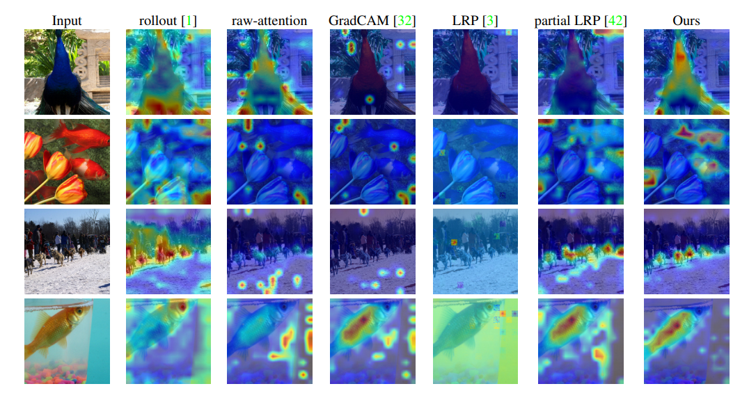
이렇게 하면 attention을 네트워크 그래프로 볼 수 있어서, 토큰 간 관계를 좀 더 직관적으로 파악할 수 있어요.
이미지 출처: velog
오늘은 Transformer Visualization에 대해 정리해봤습니다.
처음엔 복잡해 보이는데, 막상 하나씩 해보면 생각보다 재미있어요. 모델이 “어떻게 생각하는지”를 살짝 엿보는 느낌이랄까요?
여러분도 본인 모델 한 번 꼭 들여다보세요. 예상 못한 패턴이 나오면 진짜 흥미롭습니다.
혹시 Transformer Visualization 하다가 재밌는 거 발견하면 공유도 부탁드려요. 저도 궁금하거든요 🙂
참고 자료
- BertViz GitHub: https://github.com/jessevig/bertviz
- Attention is not Explanation 논문
- Transformer 공식 논문 "Attention is All You Need"
이전 글 보기